Cantech
A modern tech portfolio website designed to communicate innovation, credibility, and scale through structured visual storytelling.
The Goal
Design a modern corporate tech website that communicates brand positioning, service capability, and proof of work — guiding users from first impression to conviction within a single scrolling journey.
The Impact
A professional portfolio website that communicates brand value and technical capability within seconds — built for scalability as work and services grow over time.
My Role
UI/UX Designer (Solo)
The Project
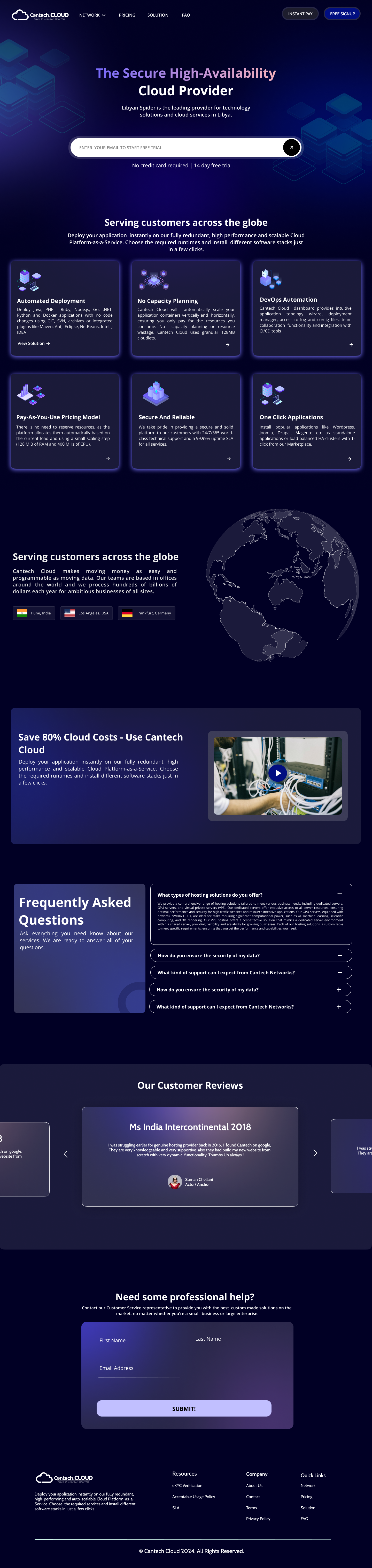
Cantech is a modern tech-driven digital presence designed to clearly communicate innovation, credibility, and product capability through a clean and structured UI system. The design follows a minimal and professional aesthetic with consistent spacing, grid alignment, and a well-defined visual hierarchy that guides users smoothly from introduction to detailed sections — services, case studies, and portfolio work. Each section is structured to support storytelling: starting from brand positioning, moving into capabilities, and ending with proof of work — ensuring a logical and engaging user journey.
The Core Challenge
Corporate tech websites are a sea of sameness — blue gradients, stock photography, and buzzword-heavy hero sections that all look identical. The design needed to be visually distinctive while maintaining the professionalism that clients and recruiters expect. Being too 'creative' was as risky as being too generic.
The Process
Structuring the Brand Story
The site's IA follows a deliberate storytelling arc: brand positioning (hero) → capabilities (services) → proof (portfolio/case studies) → credibility (team) → action (contact). This mirrors the mental journey of an evaluating client, building conviction progressively before asking for action.
Grid & Typography System
I established a strict 12-column grid and a clear typographic scale (Display → Heading → Body → Caption). Every section locks to this system — creating underlying rhythm and order that communicates professionalism and craftsmanship without being stated explicitly.
Whitespace as a Design Tool
The most important design decision was restraint. Heavy use of whitespace signals confidence — a brand that doesn't need to shout because its work speaks for itself. I used whitespace deliberately to create breathing room and direct focus onto key content.
Card-Based Service & Portfolio Layouts
Services and portfolio work are complex information. I designed card-based components that surface the most important attributes in a digestible format — making complex capability feel approachable and scannable for users evaluating the brand quickly.
No Stock Photography Policy
Stock images of handshakes and server rooms immediately undermine credibility. I replaced all photography with geometric data visualizations, abstract tech illustrations, and icon-based infographics — imagery unique to the brand that reinforces a tech-forward identity.
Key Design Decisions
Storytelling-first section structure
Starting with brand positioning, moving into capabilities, then proof of work ensures users build conviction progressively. By the time they reach the contact section, they've already understood why Cantech is the right choice — reducing friction at the conversion point.
Minimal color palette with high-contrast typography
A restrained palette communicates discipline and focus. High-contrast typography ensures readability across all contexts and reinforces the brand's clarity of thought — which is itself a credibility signal for a tech company.
Scalable component architecture
A portfolio site grows over time — new projects, new services, new team members. I designed every component to accommodate new content without breaking the visual system, which is essential for long-term maintainability and consistency.
Outcome
Cantech resulted in a corporate portfolio website that is confident, structured, and genuinely distinctive in the tech space. The storytelling-led section architecture, disciplined grid system, and restraint-first visual approach combine to communicate capability and credibility within seconds — which is exactly what a professional audience needs to feel before they reach out.
See it in full detail
View the complete design on Figma