Event Booking App
A mobile app for discovering and booking local events — fast, dark, and built for the energy of live experiences.
The Goal
Design an iOS mobile app for discovering, filtering, and booking local events — with a premium dark UI that matches the energy of nightlife and live experiences.
The Impact
A full end-to-end mobile UI for event discovery and booking, with a distinct dark aesthetic that sets a mood before the event even starts.
My Role
UI/UX Designer (Solo)
The Project
This is a full mobile app design for iOS — covering event discovery, filtering, event detail pages, seat selection, and booking confirmation. The design philosophy was 'the app is the pre-game' — it should feel as exciting as the event itself. I studied Eventbrite, Dice, RA (Resident Advisor), and Fever to identify the gap: a genuinely premium, dark, magazine-quality event app that treats the pre-event experience as part of the event experience itself.
The Core Challenge
Most event booking apps feel like utility software — functional but emotionally flat. Events are experiences. The design had to match the anticipation and excitement of a concert, festival, or club night — making the app feel like part of the event, not just a ticketing tool.
The Process
Benchmarking Existing Apps
I studied Eventbrite, Dice, RA, and Fever. Eventbrite is functional but visually dated. Dice and RA cater to niches. Fever has strong UX but a cluttered visual language. The gap was clear: a premium, dark, editorial event app with a frictionless booking flow.
User Flow Mapping
I mapped the core journey: Home → Browse/Search → Filter by Date/Type/Location → Event Detail → Ticket Selection → Payment → Confirmation. Each step was designed to minimize friction while maintaining visual excitement throughout.
Dark Theme & Color Psychology
Nighttime venues, concert lighting, and festival energy are inherently dark environments. The app's dark theme isn't a trend choice — it's contextually appropriate. Accent reds and warm ambers echo stage lighting and create subconscious associations with live energy.
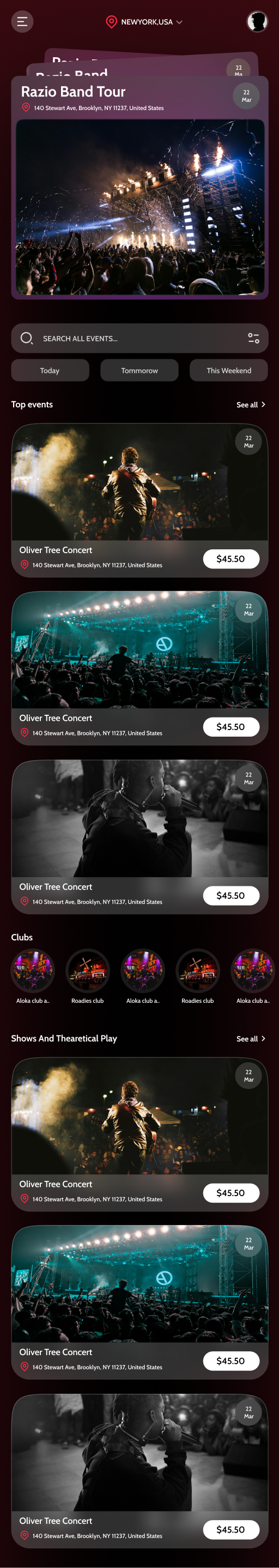
Event Card Component Design
The event card is the most repeated element in the app. I spent significant time on this: full-bleed event photography, category tags, date chips, and a price badge — all arranged to be scannable in under two seconds and emotionally compelling at first glance.
Frictionless Booking Flow
The booking flow was designed as three clean steps: Select tickets → Enter details → Pay. Progress indicators, clear error states, and a satisfying confirmation screen were all designed to reduce purchase anxiety and cart abandonment.
Key Design Decisions
Full-bleed event photography in cards
Events sell emotion. A full-bleed image communicates the vibe of a concert or festival in milliseconds. Cropped or small thumbnails dilute that emotional impact — and emotion is what drives event ticket purchases.
Red/rose accent on a dark base
Red communicates energy, urgency, and exclusivity — 'limited tickets', 'tonight only'. It creates a sense of scarcity and excitement that drives action without feeling aggressive on a dark background.
Location-first search architecture
Event discovery is fundamentally local. I placed location awareness at the top of the home screen throughout the browse experience — because an event three hours away is irrelevant no matter how good it is.
Outcome
The Event Booking App is a full-system mobile design that treats the pre-event experience as part of the event experience itself. The dark, energetic aesthetic and friction-reduced booking flow create an app that people would genuinely want on their phone — not just tolerate as a transactional necessity.
See it in full detail
View the complete design on Figma