Event Booking Revamp
A self-initiated redesign of the home screen — fixing navigation clarity, improving hierarchy, and elevating the visual language.
The Goal
Revamp the Event Booking App's home screen to improve navigation clarity, fix visual hierarchy issues, and elevate the overall aesthetic to a higher standard.
The Impact
A significantly cleaner, more navigable, and visually refined home screen that elevates the entire app's quality perception.
My Role
UI/UX Designer (Solo) — Self-initiated redesign
The Project
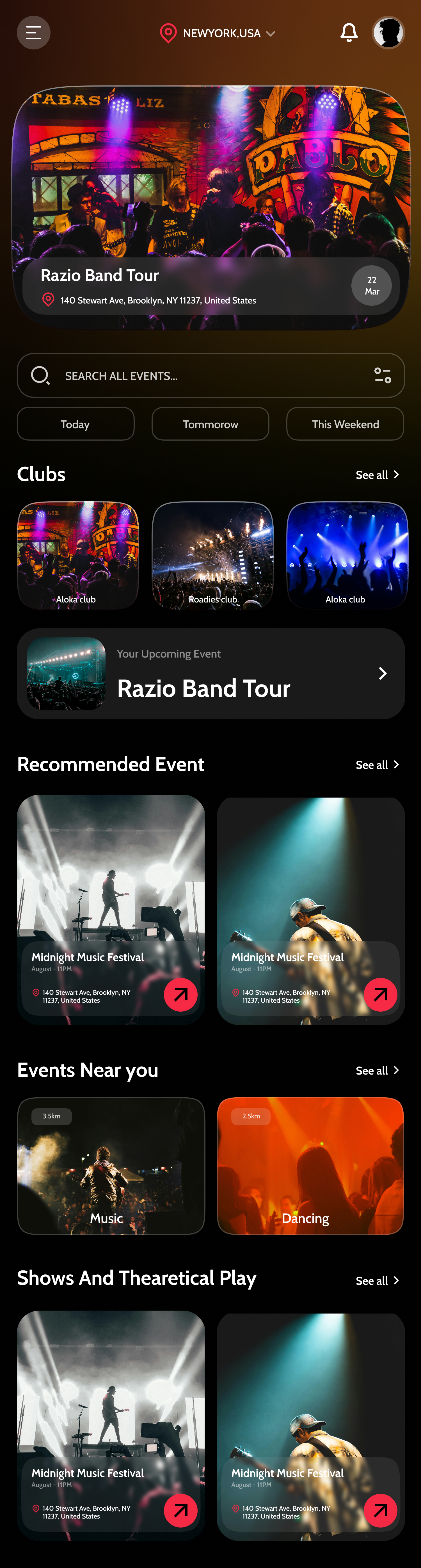
This project is a self-initiated redesign of my own Event Booking App. After shipping v1, I returned with fresh eyes and documented specific problems: visually ambiguous navigation, competing information hierarchy, and inconsistent color use. The Revamp focuses exclusively on the home screen — the most critical surface — and treats it as an opportunity to apply everything learned since building the original.
The Core Challenge
Going back to your own work with fresh eyes is harder than it sounds. The original home screen had specific, identifiable problems — but fixing them required dismantling decisions I was originally confident in and rebuilding with what I'd learned since.
The Process
Auditing the Original Design
I documented every problem in the original home screen: navigation icons were too similar in visual weight, the featured event section competed with the search bar, category filters were easy to miss, and the color palette felt muddied. Each issue became a specific design goal.
Navigation Redesign
The original tab bar used icon-only navigation. Research shows icon-only nav creates confusion unless icons are universally recognizable. I revised the active state treatment and added label reinforcement to make the current section immediately obvious.
Visual Hierarchy Restructuring
I established a clearer scanning pattern: Location → Search → Featured Event → Category Filters → Events List. This top-to-bottom structure mirrors how people actually discover events — by location first, then intent, then browsing.
Refining the Color System
The original used red accents inconsistently. In the revamp, the accent color (now a warm pink-rose) is reserved exclusively for interactive CTAs, prices, and 'live now' indicators. Everything else is neutral — making interactive elements instantly obvious.
Elevated Component Quality
Every component was rebuilt with tighter spacing, better type scales, and more intentional shadow use. The featured event card has a more cinematic aspect ratio, and category filter pills have better tap target sizing for thumb interaction.
Key Design Decisions
Pink-rose accent shift from the original red
The original red felt aggressive and urgent everywhere — which desensitizes users to its importance. A more nuanced pink-rose preserves the energy while feeling more curated and premium.
Cinematic 16:9 featured event card
The original featured card had an awkward aspect ratio that cropped event photography poorly. 16:9 is the natural format for concert and event photography — making every image look intentional rather than cropped.
Separating 'Near You' from 'Top Events'
The original mixed local and popular events in one section, creating confusion about intent. Separating them into distinct labeled sections gives users clearer mental models and reduces decision fatigue when browsing.
Outcome
The Revamp demonstrates something important: good design is never finished. Going back to my own work with a critical eye produced a significantly better product. Improved navigation clarity, tighter visual hierarchy, and a more intentional color system elevate the home screen from 'good' to 'genuinely polished' — and the process taught me as much as building v1 did.
See it in full detail
View the complete design on Figma