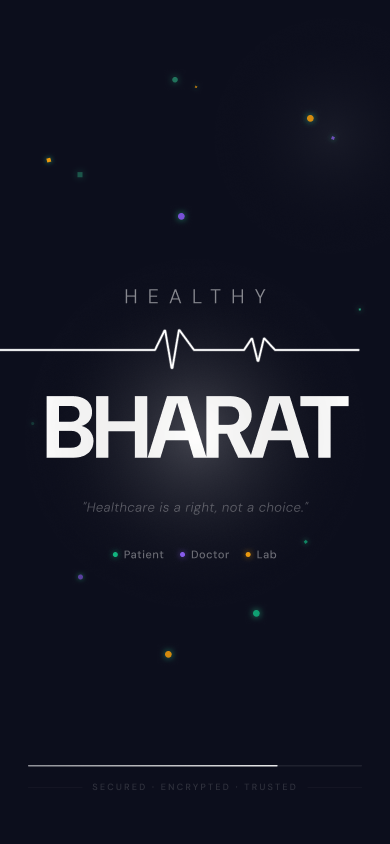
Healthy Bharat
A Healthy Bharat mobile app unifying doctors, patients, and emergency health data in one calm, role-based ecosystem.
The Goal
Simplify a highly complex, fragmented healthcare experience into a clean, intuitive mobile interface where doctors and patients interact seamlessly — with critical data accessible within seconds, even in emergencies.
The Impact
A complete, scalable mobile design system for three user types — Patient, Doctor, Emergency — with a QR-first architecture, visual health data, and multi-language support.
My Role
UI/UX Designer (Solo)
The Project
Healthy Bharat is an end-to-end healthcare mobile app that addresses India's fragmented medical ecosystem. Patients manage their own records, doctors lack instant access to full history, and emergencies are complicated by missing data. The app uses QR-based health profiles for instant access to critical information, while providing separate, role-based flows for doctors and patients within a single unified design system. The entire system is built to feel reliable, calm, and efficient — solving a real healthcare problem through thoughtful interaction design and a scalable design system.
The Core Challenge
Healthcare apps often fail because they try to serve everyone the same way. A doctor's needs during a consultation are completely different from a patient's daily health management needs. Building one app that works fluently for both — without confusion — required a deeply considered role-based architecture.
The Process
Mapping the Fragmentation Problem
I started by documenting every friction point in India's current healthcare experience: patients carrying physical reports to appointments, doctors making decisions without full history, emergencies where critical health data is unavailable. Each friction point became a specific design opportunity.
QR-Based Emergency Access Architecture
The QR health profile was the most critical UX decision. In an emergency, there's no time to log in or navigate. I designed a QR code that surfaces the patient's critical data — blood type, allergies, medications, emergency contacts — instantly, without requiring an account for first responders.
Role-Based Dual Flow Design
I designed separate but visually consistent flows for doctors and patients, ensuring role-based clarity while maintaining a unified design language. The Patient flow covers health dashboards, report uploads, appointment booking, medicine reminders, and health graphs. The Doctor flow covers patient queue, consultation history, prescription writing, and earnings.
Color System for Health Status
The color palette — green for normal, orange for attention, purple for primary actions — was chosen to communicate health status without text. A patient with an abnormal lab result sees an orange indicator immediately, without needing to read the value. This reduces cognitive overload in critical moments.
Visual Data Over Text-Heavy Interfaces
Medical data is inherently text-heavy. I replaced walls of numbers with visual graphs for health trends, structured cards for lab reports, and icon-led prescription layouts. This helps patients better understand their health trends and helps doctors make faster decisions during consultations.
Key Design Decisions
Deep navy dark theme with green, orange, and purple accents
Healthcare apps are used at all hours — early morning for lab bookings, late night for emergencies. A deep navy base reduces eye strain and feels premium. The three-color accent system communicates health status instantly without requiring users to read labels.
Multi-language support in doctor explanations
When a doctor writes a prescription or note, patients often don't understand medical terminology in English. A dedicated explanation field where doctors can write in the patient's preferred language reduces confusion, improves compliance, and builds trust.
Reminder system designed to be helpful, not intrusive
Medicine and follow-up reminders are only useful if users don't dismiss them out of irritation. I designed the reminder system with smart timing, clear snooze options, and a minimal visual footprint — effective at driving engagement without disrupting daily life.
Outcome
Healthy Bharat became a complete, user-centric healthcare ecosystem — not just a collection of screens. The role-based architecture, QR-first emergency access, visual health data system, and multi-language support combine to solve a real problem through thoughtful design. This project reflects my ability to design not just interfaces, but complete experiences that align with real-world behaviors, constraints, and the high stakes of healthcare.
See it in full detail
View the complete design on Figma