Luumpa
A D2C functional beverage brand website blending gut-friendly health messaging with bold, nostalgic branding and conversion-focused UX.
The Goal
Design a bold, conversion-focused D2C website that communicates Luumpa's health credentials and brand personality simultaneously — making users want to trust the product and buy it.
The Impact
A digital brand experience where health-conscious messaging and nostalgic fun coexist — resulting in a site that converts and that people want to share.
My Role
UI/UX Designer & Visual Designer (Solo)
The Project
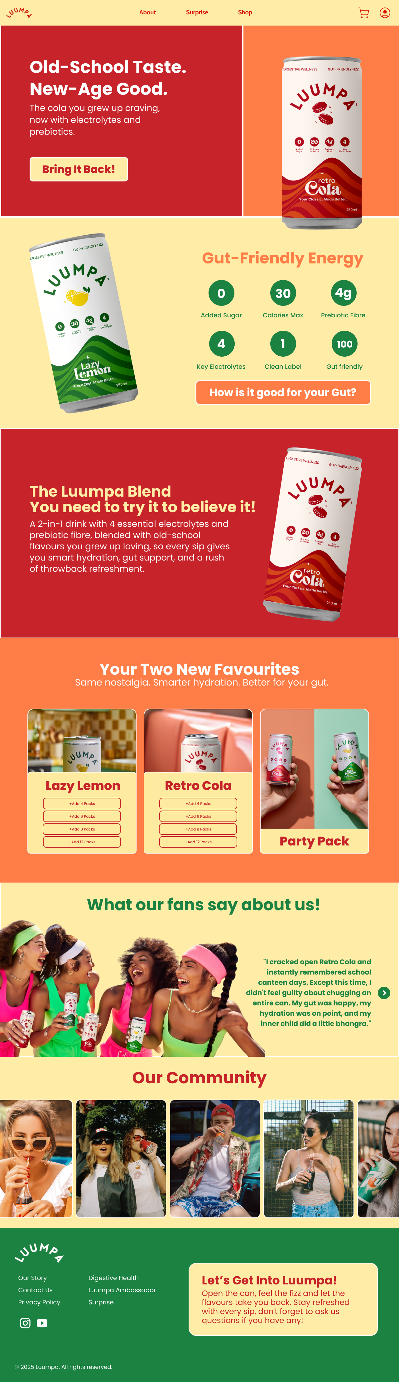
Drink Luumpa is a modern functional beverage brand offering gut-friendly hydration — low-calorie, no added sugar drinks enriched with prebiotic fibre and electrolytes, positioned as a healthier alternative to traditional soft drinks while delivering a nostalgic, fun experience. The website needed to communicate this dual identity: health-conscious enough to convert wellness buyers, fun enough to feel like a brand people genuinely want to be part of. The design is clean and conversion-focused, with copywriting playing a major role in the UX — making users feel understood before they even read the ingredients.
The Core Challenge
Functional beverage branding has a core tension: health-focused messaging can feel clinical and boring, while nostalgic fun messaging can undermine health credibility. The design had to hold both identities simultaneously — which required precise control over tone, visual language, and copywriting.
The Process
Brand Personality Definition
Before touching Figma, I built a brand moodboard positioning Luumpa at the intersection of nostalgic fun (retro naming like 'Retro Cola' and 'Lazy Lemon') and modern wellness (gut health, electrolytes, zero sugar). This dual identity became the north star for every subsequent design decision.
Copywriting-Led UX
Unlike most websites where copy is added after design, I designed around the copy. Relatable moments — 'before gym,' 'after food,' 'midday slump' — serve as section anchors, connecting product benefits to real moments in users' lives. This approach makes the value proposition feel human, not clinical.
Visual Hierarchy for Health Benefits
Key benefits — zero added sugar, low calories, gut health, electrolytes — needed to be immediately visible without creating a label-reading experience. I designed a scannable benefits display using icons and short labels so users understand the product's differentiation in under three seconds.
Product Section & Purchase Flow
The product browsing section uses card-based layouts with minimal friction CTAs. I kept the path from 'see product' to 'add to cart' as short as possible — no unnecessary steps, no competing upsells during browsing. The goal was awareness to purchase with the fewest possible decisions.
Social Proof & Community Integration
For a new-age D2C brand, peer validation matters more than brand claims. Community testimonials and user-generated content are embedded into the design at strategic points to reinforce trust before and after the product section.
Key Design Decisions
Nostalgic product naming ('Retro Cola', 'Lazy Lemon') as the visual hero
Product names carry emotional weight. I designed product cards so the name is the typographic hero — large, expressive, and playful — making even the name feel like part of the brand experience and improving recall.
Relatable micro-moment copywriting as UX anchors
'Before gym,' 'after food,' 'midday slump' are not just taglines — they organize content around real moments rather than product features. This makes the UX conversational and personally relevant, which dramatically improves engagement and connection to the product.
Lightweight, distraction-free page architecture
D2C conversion depends on keeping users focused on the product path. I eliminated visual clutter, reduced competing CTAs, and kept the page fast and minimal — ensuring users move smoothly from product discovery to purchase without getting lost.
Outcome
The Luumpa website became a digital brand experience that holds two identities simultaneously: health-credible and genuinely fun. The copywriting-led UX, scannable benefits hierarchy, nostalgic product design, and distraction-free purchase flow created a D2C wellness brand site that feels fresh, approachable, and conversion-ready — the kind of brand you discover and immediately send to someone you know.
See it in full detail
View the complete design on Figma