Qonaq Health
A healthcare and wellness tourism platform that makes global medical treatment, recovery, and holistic wellness feel guided and trustworthy.
The Goal
Create a trusted digital experience that simplifies medical tourism — making it easy for international users to find hospitals, book doctors, and plan their entire wellness journey in one place.
The Impact
A conversion-focused, multilingual website that makes complex medical tourism feel guided, reliable, and accessible at a glance.
My Role
UI/UX Designer (Solo)
The Project
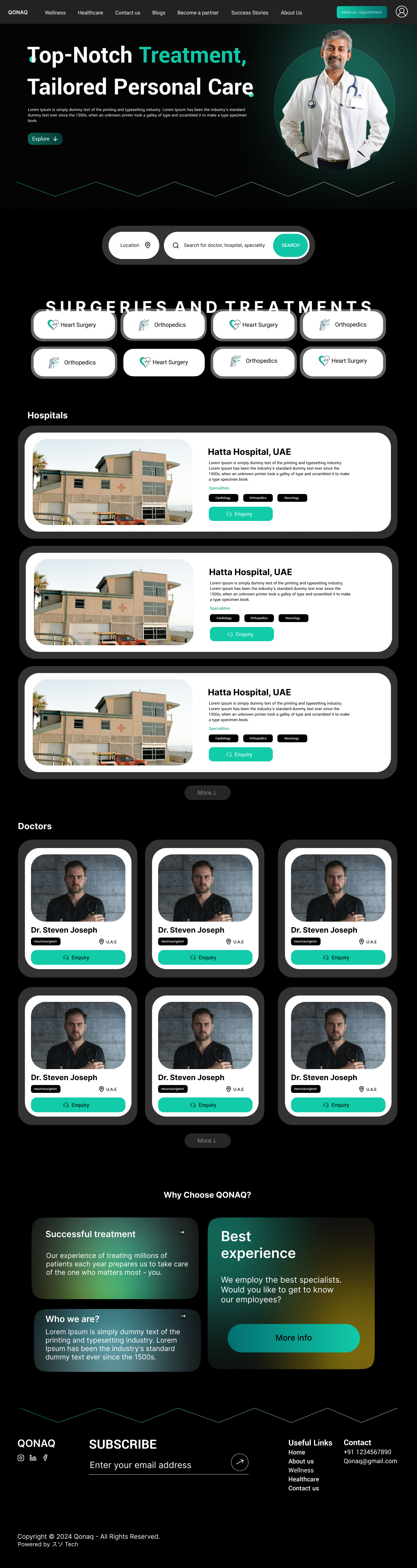
Qonaq Health and Wellness is a healthcare and wellness tourism platform that connects users with global hospitals, doctors, and wellness retreats — acting as a one-stop solution for medical treatments, recovery journeys, and holistic wellness experiences including travel, accommodation, and post-treatment support. From a UI/UX perspective, the website stands out with a clean, structured layout and strong visual hierarchy that immediately communicates trust and scale through key metrics. The design balances emotional appeal with functional clarity, making a complex process — medical tourism — feel simple, guided, and conversion-focused.
The Core Challenge
Medical tourism is inherently complex and anxiety-inducing — users are dealing with health decisions, foreign hospitals, travel logistics, and language barriers simultaneously. The design had to reduce that friction dramatically while projecting global-scale credibility.
The Process
Understanding the Medical Tourism User
People using a medical tourism platform are in a vulnerable, high-stakes situation — dealing with health decisions, foreign hospitals, and travel logistics all at once. I mapped the emotional journey from initial health concern through hospital comparison and booking, and let that emotional context shape every design decision.
Establishing Trust at First Glance
The homepage opens with credibility metrics — number of hospitals, doctors, and wellness centers. Users need to see proof of scale before they engage. I front-loaded these numbers prominently as the first thing users see after the hero.
Information Architecture
With services spanning hospitals, treatments, wellness retreats, travel, and accommodation, the IA challenge was substantial. I designed a navigation system with well-defined categories (Hospitals, Treatments, Wellness) that kept distinct user intents separate and never overlapping — making user journeys straightforward even for first-time visitors.
Card-Based Browsing System
Hospital and retreat discovery is a comparison task. I designed a card system that surfaces the most decision-relevant information in a scannable format. Cards enhance scannability and decision-making without overwhelming users with detail.
Multilingual & Global UX
Medical tourism users come from across the world. I integrated multilingual support and designed the interface to work across cultural contexts — using universally understood icons, clear CTAs, and imagery that reflects a global, inclusive platform.
Key Design Decisions
Dual primary CTAs: 'Book Appointment' and 'Get Treatment Plan'
These two CTAs capture distinct user intents — the action-ready user and the research-phase user. Offering both paths prevents drop-off from either segment and increases overall conversion across the funnel.
Wellness imagery over clinical photography
Clinical hospital photography creates anxiety. I used calm, aspirational wellness imagery to emotionally reframe the experience as healing and empowering, not intimidating — which is critical for a platform asking users to make high-stakes health decisions.
Metrics block above the fold
Showing hospitals, doctors, and wellness center counts at the hero immediately establishes scale and social proof. It tells users they're not alone in choosing this platform and that the network is large enough to find what they need.
Outcome
Qonaq Health became a premium digital medical tourism experience that feels reliable, informative, and conversion-focused. The design successfully collapsed a complex, multi-step process — finding hospitals, booking doctors, planning travel and recovery — into a guided, calm, and trustworthy digital journey that works for international users across languages and health contexts.
See it in full detail
View the complete design on Figma